Color is one of the most powerful tools in interior design, yet it’s often the most intimidating decision for homeowners. At Showeffect, we use color psychology to create spaces that don’t just look beautiful—they actually influence how you feel and function in your home. Here’s how to harness the emotional power of color in every room.
Understanding Color Psychology Basics
Colors aren’t just visual elements; they’re emotional triggers that affect our mood, energy levels, and even our perception of temperature and space. Cool colors like blues and greens tend to calm and relax us, while warm colors like reds and oranges energize and stimulate. Neutrals provide balance and sophistication, serving as the perfect backdrop for bolder choices.
The key is matching the psychological effect of each color to the purpose of your room. A color that works beautifully in your bedroom might be completely wrong for your home office, even if you love that shade.
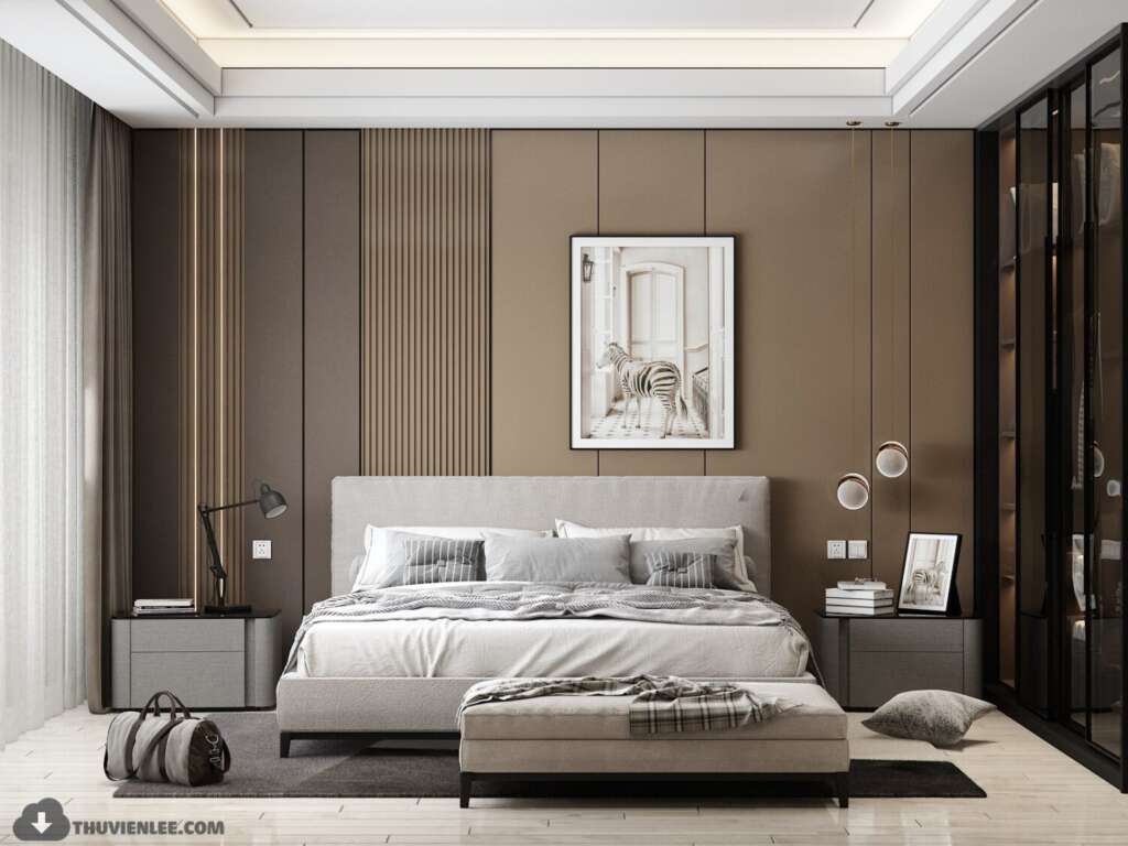
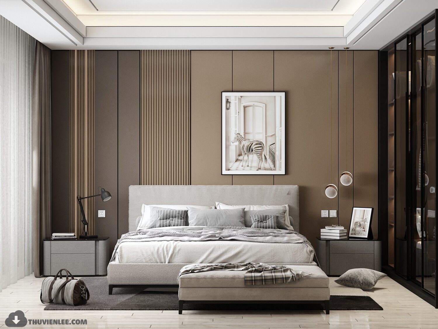
Bedroom: Creating Your Personal Sanctuary
Your bedroom should be a retreat from the world, so we typically recommend softer, more subdued colors. Blues are scientifically proven to lower blood pressure and heart rate, making them ideal for promoting restful sleep. Soft greens bring the calming essence of nature indoors, while muted lavenders combine the stability of blue with the warmth of red for a soothing effect.
If you crave warmth, consider dusty pinks, warm grays, or sandy beiges. These create a cozy envelope without the stimulating effect of brighter warm tones. We often use deeper, moodier colors like charcoal or navy in primary bedrooms where adults want a sophisticated, cocoon-like atmosphere. Just ensure you have adequate lighting to prevent the space from feeling cave-like.
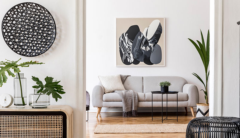
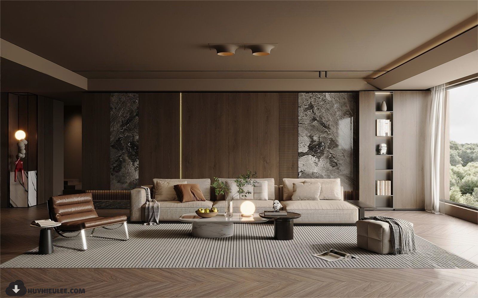
Living Room: Balancing Energy and Comfort
Your living room needs to work for multiple activities—relaxing with family, entertaining guests, watching movies, or reading. This calls for a balanced color approach. Warm neutrals like greige, taupe, or warm white create a welcoming foundation that works for various moods and occasions.
This is where we love to introduce accent colors that reflect your personality. A rich terracotta or burnt orange adds warmth and conversation-starting vibrancy. Deep jewel tones like emerald or sapphire bring sophistication and richness. These bolder choices work best on a single accent wall, in furniture pieces, or through accessories where they energize without overwhelming.
Kitchen: Appetite and Social Connection
Kitchens benefit from colors that stimulate appetite and encourage social interaction. Warm whites and creams keep the space feeling clean and fresh while maintaining a welcoming atmosphere. Soft yellows evoke happiness and optimism—perfect for starting your day. Warm wood tones bring organic comfort that makes people want to gather and linger.
For more adventurous clients, we might introduce sage green cabinets for a fresh, nature-inspired look, or deep navy for dramatic sophistication. Red accents in a kitchen can stimulate appetite and energy, but we use them sparingly as too much can feel overwhelming in a space where you spend significant time.
Home Office: Focus and Productivity
Your workspace needs colors that enhance concentration and creativity without causing fatigue. Blue is the productivity powerhouse—it encourages focus, clear thinking, and calm efficiency. Green reduces eye strain and promotes balance, making it excellent for spaces where you spend long hours at a computer.
We often suggest a blue or green as the dominant color, then add yellow accents to spark creativity and optimism. Gray can work well in an office, providing a neutral, professional backdrop, but make sure to choose warmer grays and add plenty of natural textures to prevent the space from feeling cold or institutional.
Bathroom: Spa-Like Serenity
Bathrooms should feel like personal spas—clean, calm, and rejuvenating. White remains the classic choice because it feels crisp, clean, and spacious, but pure white can feel sterile. We typically recommend warm whites or whites with subtle undertones of gray or beige.
Soft aquas and sea glass blues evoke the tranquility of water, creating an instant spa atmosphere. Pale greens bring freshness and renewal. For powder rooms where guests spend only a few minutes, you can be bolder with dramatic blacks, rich navies, or even vibrant jewel tones that make a memorable statement.
The 60-30-10 Rule in Practice
Regardless of which colors you choose, we follow the 60-30-10 rule for balanced, professional-looking spaces. Your dominant color (typically a neutral) covers about 60% of the room—walls, large furniture pieces. Your secondary color takes up 30%—upholstery, curtains, accent walls. Your accent color appears in the remaining 10%—throw pillows, artwork, decorative objects.
This proportion creates visual harmony and prevents any single color from overwhelming the space. It also makes it easy to refresh your look over time by simply changing out those 10% accent pieces.
Testing Before Committing
Color looks dramatically different depending on lighting, surrounding colors, and the size of the application. We always recommend testing paint colors by applying large swatches directly on your walls and observing them at different times of day and in various lighting conditions. That soft gray that looked perfect in the store might read purple in your north-facing living room at dusk.
The same applies to fabrics and finishes. Order samples and live with them in your space before making final decisions. What works in someone else’s home or in a showroom might not work in yours.
Your Personal Response Matters Most
While color psychology provides valuable guidelines, your personal associations and cultural background also influence how colors make you feel. If blue reminds you of a childhood bedroom you hated, it won’t be calming no matter what the research says. We always balance psychological principles with your unique experiences and preferences.
At Showeffect, we use color as a strategic tool to enhance how you experience your home every single day. The right palette doesn’t just look good—it makes your life better.
Struggling to choose the perfect colors for your space? Let’s explore options that will make you feel exactly the way you want to feel at home.